Branding has been an established concept now in business and marketing for sometime; however, to many laypersons they may see branding as little more than creating and using a logo. That is only one facet however of building a successful brand identity, whereas the full result of successful branding is to bring about a positive view of a company and its products and services. Here are a few of the key steps to developing a brand for your business.
Find What Makes You “You”
Each company is unique in their own way, otherwise why would you have set about to build your business in the first place? Figure out what it is that sets you apart, your unique value proposition, and use that to help identify your business and what you offer to your customers.
Identify Your Values
What does your company stand for? You may have values you represent externally, and then values you hold internally, but whichever values you have they need to be something you stand for and something that helps how you communicate to your clients and employees. At Ortwein Sign for instance, we value craftsmanship and pride of work, and this means that not only are we focused on fabricating the best signs for our clients, but when we do a great job it’s not only its own reward but it’s also rewarded internally.
Develop Your Visual Identity
This is the component of branding that is most familiar, as a “brand” is often represented through the visual medium of logos, signs, ads, and other marketing assets. Even here though there’s more to it than just designing a logo, as you’ll want to consider the colors you use, the style of font, and of course consider not only what your logo should look like but how well you can represent your logo across all mediums. You’ll want a logo for instance that can look good on a sign, a business card, and a social media profile photo.
Speak with One Voice
One concept that companies often struggle with is the concept of a company “voice”. Especially with the continued growth of social media as a business platform, companies now more than ever need to find their voice and try to use it for their communications internally and externally. Companies like Moon Pie are now known for their humorous, almost sardonic voice, especially on Twitter. However, for some companies, such as a bank, they may want to go for a more serious, yet friendly tone. Though it may take you sometime to find the right voice, once you do it’ll benefit your brand, and therefore your business, incredibly.
Your Brand at Work
Branding isn’t always the end all be all to your business problems; however, the lack of a cohesive brand could be the cause of many problems. Therefore it’s important to use what we highlighted above, an established identity, strong company values, visual assets, and a singular company voice, and with those in place you can use it to guide your business for years to come.
We’ve already discussed and highlighted the 6 benefits of wayfinding signs as well as the various types of wayfinding signs. Now let’s talk about what you need to do to ensure your wayfinding system is successful. Here are 5 best practices to ensure you achieve success with your wayfinding systems.
Identify a Naming Convention
If you have a particularly large complex, then you may need signs numbering in the dozens and even hundreds. When developing signage to that scale you need to keep in mind that a sign in one building representing an office or break room for instance should look the same, and read the same, as a sign representing an office or break room in another part of the building.
Wayfinding signage is at its best when it’s recognizable even for just a quick glance, and maintaining a naming convention for your spaces will help with this.
Setup Wayfinding Signage For Easy Maintenance and Change
Wayfinding signage’s lifespan can vary depending on the needs of the business and the static or dynamic nature of the physical space itself. Construction of an additional building on a campus for instance, college or corporate, would mean there would be a need for additional signage. This signage should match the existing signs, and that can mean the need for additional investment. Additional digital signage therefore can be quite an investment. However, if an entire department changes
Not everyone can purchase a wayfinding system with digital signage throughout, and even when you do you need to ensure you have employees at your office, or a partner, who can input messages and serve as a contact or source for any repair needs.
Future-proof and Value Add
Though digital signage requires a greater initial investment, you may also find additional value in your sign system as you find or develop new uses for your signage. Digital signage can add potential marketing abilities, internally or externally, and if the latter you might be able to charge for commercial use or advertisement. Overtime these ads can help the return on investment of your digital wayfinding signage.
If you’re considering using physical wayfinding signage though, then future-proofing signage may look a little different. In this case, you’ll need to consider developing a partnership with a sign company that can routinely provide updated signage to your wayfinding systems.
Clear and Concise Messaging.
Wayfinding signage needs to be read at varying speeds. You’ll want to consider this when developing your wayfinding system, and while most may be able to read at a slower pacec you have to keep in mind especially those folks hurriedly trying to find their destination. Simple and clean sign design can help convey the message you want the receiver to understand. Convoluted messaging, smaller text sizes, and ornate fonts would muddle the message.
Standard Positioning and Placement
Probably one of the most crucial aspects of an effective wayfinding system is the physical locations of the wayfinding signage itself. ADA signs are required by law to be positioned in specific locations; however, for those that aren’t required to be ADA compliant, there’s more leeway. Even so, you should still design the system so that if you entered any room in the complex a visitor would know where to expect the signage to be.
If you consider an airport with an effective wayfinding system, you know after spending just a little time inside that all the Gate #’s are positioned in the same space. This is so passengers do not have to spend an exorbitant amount of time looking for their gate. You may also be thinking of an airport with a poor wayfinding system that you have visited, and if so you may be thinking now of how this poorly affects passengers’ moods, the time it takes to go through the airport extends, and this could ultimately lead to missing one’s flight.
Conclusion:
As you’ve seen, Wayfinding is used across various industries, from health care, aviation, schools, businesses, and so many more industries we have not yet touched on. Though there are unique challenges and needs for each, developing a comprehensive wayfinding system with these best practices in mind will help your wayfinding system achieve the success you want.
To help further the success of your wayfinding system, consider partnering with a sign company like Ortwein Sign. We have the knowledge and know-how to fabricate, install, and service your wayfinding system and signs. Call us today at (423) 867-9208 or contact us online to see how we can help solve your wayfinding problems!
If you’re entering a new business for the first time, often you’ll look for a wayfinding sign to guide you to where you need to go. In a theme park or mall, this can be a matter of convenience. In a hospital or in an emergency, it can be a matter of life or death. Wayfinding systems do not just guide customers to where they need to go though. They also offer business owners a chance to brand their signage and thus give their customers a sense of place when visiting your business. For these reasons and more, wayfinding signage has become an essential component of interior signage for buildings of all size.
In this blog, we will discuss the different types of wayfinding signs, the benefits of wayfinding signage, and the opportunities that they provide businesses as well to brand their shop.
What is Wayfinding Signage?
In “Issue of wayfinding concept in museum interiors”, by T. Sarihati, R. Firmansyah, S. Salayanti & N. Hasanah A. Rosyad (PDF), the authors state “Wayfinding is a means to provide information related to directions, special signs for certain locations. Wayfinding is a system that provides predictable locations by various types of information and hierarchical instructions that enhance understanding and navigation in an environment.” Wayfinding systems and signs therefore serve to acclimate a person to a space and help guide them through it to one or more destinations.
What are the 6 types of Wayfinding Signage?
According to T. Sarihati, R. Firmansyah, S. Salayanti & N. Hasanah A. Rosyad, there are 6 defined types of wayfinding signage. Their descriptions of each type of signage are as follows:
Orientational Sign
“Orientational sign is a panel of signs that contains clear information about the position of a person in an environment, such as maps, architectural references from a building, and the plan of the circulation of lanes in and out. Road search is characterized by knowledge of the route obtained through procedural rules.”
Information or Informational Sign
An Informational Sign “refers to the specifics and details of information, with the sign form being adjusted to the information that is to be conveyed. “
Directional Sign
Directional sign shows the direction or location of the destination to be directed by visitors. This sign is an explicit navigation tool. It is expected to make visitors more efficient and comfortable in an environment.
Identification Sign
Identification signage gives the identity of an object or place according to its type and function.
Statutory Sign
Statutory (regulatory) sign is in the form of regulations, general restrictions, or permits for a particular activity. Its main function is to maintain one’s safety from danger and informs what to do and not to do.
Ornamental Sign
Ornamental sign serves as a decorative element that aims to beautify, enhance, or beautify an overall appearance of an environment or as a complement to the elements of a sign (Kusuma 2018)
What are the benefits of Wayfinding Signage?
Improves Traffic Flow in Your Workplace or Business Environment
At its core, a wayfinding system is setup to improve the flow of traffic for visitors and employees alike. By allowing people to be a more astute guide through the use of wayfinding signage, you’re improving people’s ability to traverse your spaces. This singular benefit impacts all the benefits to follow.
2. Improves Workplace Environment for Visitors and Employees Alike
In Best Practices for Wayfinding in a Hospital Setting by Jerod S Potter, a Clinical Informaticist at Salem Health, he analyzed wayfinding studies in hospital settings and found one study, Benefits of Effective Wayfinding Chaudhury, H., Mahmood, A., & Valente, M. (2009), saw that “[p]atient and visitor satisfaction scores also rise when better wayfinding improves movement through the hospital, positively impacting the staff and reducing turnover. [Likewise], better design…facilitates a healthier, happier environment for staff helps to increase staff satisfaction.”
3. Direct Visitors to Unseen or Underutilized Spaces and Facilities
Instead of letting visitors stumble into a space or place you want them to find, an orientational sign can let them know it exists, a directional sign can point them where to go, and an identifying sign can let them know they’ve arrived. Without such signage visitors may never find this place, nor even know it exists to begin with. Therefore a proper wayfinding system can help inform and orient your visitors to the myriad of locations in your facility or business that they can and cannot visit.
4. Enhance Brand Identity and Sense of Place
If two companies such as Target and Wal-Mart were to be placed within the same building adjacent to one another, thanks to their use of wayfinding signage and recognizable brand symbols you would know doubt still know when you’re in which store’s space. Though this example us unlikely to occur, you may have commercial space such as malls, corporate complexes, or even hospitals or schools where this is an increased reality. Even if you’re the only occupant of your business space, you still want your visitors and employees to feel as if they’re in your businesses’ space, and wayfinding signage allows for that ability especially when paired with quality brand design and brand implantation. Signs marking offices and doors can include a small logo for instance of your company, or perhaps they could simple have an artistic rendering of shapes using your logo’s colors. Both are methods for which you can with varying levels of subtlety tell people in your building where they are at and what business they are in at that moment in time.
*Indicates terms that are often linked to Interior Signage, though not exclusively so.
ADA Signs*: Signs that meet the American Disability Act specifications for accessibility, which include placement, design, color, content, and style guidelines. Often these include signs with braille and ADA approved icons.
Aesthetics: elements of signage that project a particular level of beauty and value, including aspects of design, color, form, and quality of craftsmanship that appeal to a viewer’s artistic sensibilities.
Animated signs: a sign that uses changes in light and color to create the impression of motion, or that incorporates actual mechanical elements that move. Animated signs may achieve motion through the use of electrical power or by mechanical means, for instance wind currents. Signs that flash on and off give the impression of motion, but in animated signs, the motion is more integral to the design and message.
Awning signs: sign mounted to a building so that it provides information while also serving as shelter. Or signage, usually a vinyl application, affixed to existing awnings.
Backlighted letters: open-backed or translucent and lit from within or behind, that throws light back onto the support surface to create a halo effect around the letters. (Sometimes called silhouette or halo lettering.)
Ballast: the electrified structure that secures and powers fluorescent lamps.
Banners: portable signage made of a light, flexible material like cloth or vinyl that is hung or strung from hooks or cord. Often used to announce events and openings, banners function well for short-term signage and in-home use, or can be fabricated out of durable materials for long-term reuse indoors and out.
Bench signs: lettering and imagery applied to the back section or other surfaces of public seating, for instance on park benches and bus-stop seating.
Building fascia: the exterior wall of a building, rising from ground level to the roofline eaves and extending across the full width of the structure.
Building mounted signs: signage hung from or affixed to the wall or roof of a building.
Cabinet signs: the frame or external structure of a box-like sign that encloses the various functional elements of the design, whether electrical or dimensional components.
Canopy signs: sign, like a marquee, constructed or affixed to a building in such a way that it serves as a canopy over the space below; Or a sign affixed to a canopy.
Carved signs: signs made of wood or synthetic materials with lettering and graphics deeply gouged into the surface of the substrate. These incise carved elements are usually painted or gilded with 23K gold leaf.
Changeable copy panels: a section of an otherwise permanent sign that allows the message to be amended, updated, or otherwise modified using track lettering or dry erase, etc. Popular uses include A-frames and menu boards.
Changeable copy signs: signage structure and lettering that provides panel-support or letter tracks allowing full sign changes and updates. Popular for informational signage and announcements.
Channel letters: three-dimensional letters, often hollow, and may or may not incorporate a light source within.
Conforming sign: a sign that is constructed and installed in compliance with design, material, and construction regulations issued by the municipality in which it appears.
Contrast: the relative difference or variance in tone and color between elements in a sign that allow each element to stand out; for instance, light colors on a dark background, dark type on light background, or overlays of similar colors from pale to deep tones.
Copy: the text message or words contained in a sign.
Copy area: the sections of a sign that contain text message as opposed to imagery or pictorial elements.
Cost per thousand (CPM): the cost of bringing a message to the attention of a thousand viewers. CPM is calculated by dividing the cost of a given advertising medium by the number of individuals who will view or be exposed to the medium. Well-designed and displayed signage on buildings or on vehicles is seen by so many individuals on a daily basis that signage is considered one of the most cost-effective modes of advertising, with low CPM.
Custom signs: a sign made to a customer’s specifications, including their logo, copy and colors.
Decals: a printed film, usually made of vinyl, with a pressure sensitive adhesive.
Dimensional letters: cast, molded, fabricated, or cut-out lettering or design (logo) applied to create a raised image on signage.
Directional signs: signage that help drivers and pedestrians to navigate a given location or event, whether interior or exterior. For example, parking signs, signs featuring destinations with arrows, etc.
Directory signs*: signage listing names and locations for multiple business tenants in a building, or the companies in an industrial or office park.
Double-faced signs: signage with two fronts, hung so that the message can be seen from either side (see projecting sign).
Electric signs: signage that contains moving or lighted elements wired for electricity.
Electronic message centers: signage that features changeable text and/or illustrations, using computer software or other technology to automate the messages delivery schedule.
Environmental Graphics*: Graphics that are applied to a wall, often with vinyl or paint, and thus are often considered murals or wall art. These are primarily considered to be interior signs; however, they are not exclusive to interior spaces.
Exterior illuminated signs: sign lit by a light source apart from and aimed at the face of the sign (not lit from within).
Face: the front of a sign, where the message is carried.
Fascia signs: sign mounted on a building face (wall).
Flashing signs: a lighted sign that turns on and off, creating the illusion of movement and attracting attention to the sign’s message. Flashing signs usually contain a single primary message that is repeated over and over as the sign cycles on and off.
Flat cutout letters*: dimensional letters cut from a broad sheet of metal or composite.
Fleet graphics: a vehicle graphic or wrap template applied to multiple vehicles operated by one company. A great way to build brand recognition and gain exposure while off premise. A well designed fleet can make a business appear larger and enhances their visibility in the communities they service.
Fluorescent lamp or tube: the glass tube in fluorescent lighting that contains luminescent vapor that lights up when electrified. Fluorescent lamps are manufactured to fit into standard ballast sizes or electrical receptacles.
Font: a unified design for a set of letters, numbers, and punctuation marks, incorporating specifications for standard roman typeface, boldface, italic, and all combinations of these (e.g., bold italic).
Freestanding signs: signage installed on posts or other supports that are not attached to any building or structure. A sign that stands on its own.
Front-lighted letters: channel letter illuminated from behind or containing a light source, with translucent face that conveys light forward.
Full service sign company: signage provider with ability to shepherd a project through the entire process from site selection through engineering, permitting, design, manufacture, and installation. Also, a provider of short and long-term signage, interior and exterior, for all applications.
Ground signs: freestanding, self-contained sign not supported by posts or other structures.
Incandescent bulbs: a vacuum sealed lamp (bulb) that directs an electrical charge through a filament, which glows hot and gives off light.
Legibility: ability to decipher lettering and message elements based on design and fabrication quality of signage. How well a sign can be seen and read.
Logo: a unique design composed of text, letters, and/or images that represent a company’s brand or identity.
Mall signage*: wall-mounted, banners, POS/POP, and all types of signs located within the interior of commercial buildings or malls.
Marquee: a substantially constructed canopy often of wood, metal, and/or glass components constructed to overhang an entrance to define the space and provide shelter to those entering and leaving.
Marquee signs: lettering and imagery affixed to a marquee canopy, sometimes referring to the canopy itself along with the message text and images. Typical marquee signage is found at the entry to theaters and movie houses overhanging the box office and announcing current and future shows.
Menu boards*: changeable copy signs, typically used by retailers to list items and prices of good currently offered, or by food service and restaurateurs to describe daily meals offered. Often constructed with use of track lettering.
Message centers: variable message sign controlled by computer or other off-site means, allowing message to be updated from a remote location.
Mobile signs: sign mounted on a flatbed or other vehicle for transportation to various locations where it is temporarily being used.
Monument signs: a freestanding, low-profile ground sign.
Neon signs: sign fashioned from continuous hollow tubing bent in the shape of letters or images, filled with gases that glow when an electrical current is passed through the tubing.
Neon tubing: hollow tubing that is bent into shape and filled with various inert gases that glow different colors when electrical current is passed through them.
Off-premise signs: a sign not directly associated with the property or location at which it is displayed; e.g. outdoor advertising or event announcements displayed at locations unaffiliated with the product or event that is the subject of the sign.
On-premise signs: signage related to the goods and services offered at the property or location at which it is displayed, such as store names, theater marquees, building directories, monument signs, POP banners, etc.
Open channel letters: dimensional letters with open fronts that, when illuminated, reveal the light source. At times, open channel letters use a sheet of transparent material to protect any interior elements.
Painted wall signs: wall-mounted building sign with lettering and imagery on face surface
Pan channel letters: three-dimensional letter with sides and back constructed to hold embossed or debossed panel for front of letter.
Pan faces: a three-dimensional sign face (front) that includes molded raised or inset design elements; sometimes called embossed or debossed face.
Permanent signs: durable signage mounted or affixed for long-term use, not easily removed, and resistant to weather and other wear and tear.
Point of Purchase signs (POP; also Point of Sale, POS): signage posted at the location of goods and services offered for sale, advertising items or special sales.
Portable signs: signage not permanently affixed to a building or ground, nor wired for electricity or other utility, and easily removed to another location with little or no need for tools or special equipment.
Post and panel signs: sign installed by mounting on a single or multiple support posts.
Projecting signs: building-mounted sign installed perpendicular to the fascia of the building (appropriate mounting for double-faced sign).
Push-through: lettering or logo image cut through the sign face and backing material and mounted or inlaid so the sign looks as if the lettering or image had been pushed through, up, and out of the sign. Sometimes push-through lettering is backlit through the sign, or the fascia of the lettering is translucent to allow lighting the imagery from behind.
Pylon signs: freestanding sign with visible supporting posts or other foundational structure.
Raceways: for electrical signs, the enclosure that holds sign elements, which may also be the structural element that is mounted on a wall or other support element.
Readability (also called conspicuity): how well the sign can be perceived and understood by viewers; the level of clarity that allows the message to come through.
Returns: for channel letters, the sides of the letters.
Reverse channel letters: channel letter with opaque face and side walls.
Roof signs: signage mounted on the roof of a building.
Sidewalk/sandwich signs: portable and relatively lightweight signage constructed to stand independently, not mounted or affixed to its location, often fabricated as A-frame.
Signs: graphic or visual display to inform viewers about the particular location, and/or to advertise a company, product, service, or event.
Sign band: the area above the entrances to a tenant spaces in a multi-tenant complex where the tenants can post signage specific to their occupancy.
Signage: aggregate of signs for a particular use or location
Single-face signs: a sign with only one side carrying the message.
Stationary signs: a sign that is mounted in a permanent manner, usually including electrical power service that makes it difficult to move the sign without specific tools or equipment.
Stickers: a printed film, usually made of vinyl, with a pressure sensitive adhesive.
Temporary signs: any sign intended for short-term us or not permanently mounted at the display site, including such items as banners, political lawn signs, and construction site panels.
Time and temperature display: an electrified sign with a variable lighted message showing the current time interchanged with the current temperature, often displayed as elements in larger signs created for banks, corporations, institutions, or organizations.
Transformers: electrical equipment that takes available voltage and current at a site and converts it to the levels required by elements in the signage.
Under-canopy signs: sign designed to be mounted under a canopy.
Variable message signs: like a changeable message sign, one that is designed to convey differing messages at different times. Also includes changeable message, changeable copy, time and temperature sign, electronic message center, and menu board.
Variance: permission from a municipality for signage or installation to vary from regulated sign specifications. Variances are awarded or denied following a hearing before appropriate boards and commissions with authority to review sign design and usage requests.
Vehicle lettering: text, graphics or logos applied to the doors, sides, hood, roof, windows or tailgates of cars, vans or trucks. One of the most inexpensive and effective ways for businesses of all sizes to advertise while off premise.
Vehicle wraps: graphically designed vinyl configured and cut to fit a specific vehicle that, when installed, encases the vehicle in the graphic design to create a dynamic, eye-catching, mobile advertisement.
Visibility: as in readability, how well the sign can be perceived and understood by viewers; how well the sign can be seen against its surroundings.
Wall signs/graphics*: sign mounted on the wall of a building, which may include the exterior or interior walls
Wayfinding*: as with directional signage, signage that assists viewers or travelers in finding their way to a destination.
Window signs (graphics)*: signs displayed in window, or graphics applied directly to the window, often adhesive backed vinyl permanently affixed to the interior of the glass.
Introduction to the International Building Code (2018) & International Fire Code (2021)
In 2018, the International Code Council (ICC) released the latest iteration of the International Building Code (IBC). The IBC addresses everything from building materials, to signage, accessibility, occupancy and more. In the United States in particular, the IBC is the code most prevalent with regards to building and construction, and often serves as the starting point for jurisdictions across the country.
In 2021, the ICC released the latest iteration of the International Fire Code (IFC). The IFC builds off of work by the ICC on codes for the IBC, the International Plumbing Code (IPC), International Fuel Gas Code (IFGC), and more, to focus specifically on a set of base requirements for fire prevention and protection systems.
As with all ICC codes, the implementation of IBC and IFC varies per jurisdiction, as does their enforcement.
History of ICC
According to StrategicStandards.com, “Building codes were first seen in the United States in the early 1700’s AD. George Washington and Thomas Jefferson encouraged the development of building regulations to provide minimum standards to ensure health and safety of our citizens.”
Since that time, a growing interest in coalescing various building codes to form a standard set of codes that companies could consult when constructing and adapting structures led to the creation of various building codes.
Ultimately, after a variety of codes and standards were created and used in different jurisdictions, the International Code Council (ICC) was created in 1994 to clear up confusion. According to ICCSAFE.com, “[the ICC] brought together three different organizations that had developed three separate sets of model codes throughout the U.S.: Building Officials and Code Administrators International, Inc. (BOCA), International Conference of Building Officials (ICBO) and Southern Building Code Congress International, Inc. (SBCCI).”
Among the facets of new construction and renovation that the IBC codified, and the elements of protection and prevention codified by the IFC, signage remains a key component.
IBC & Accessibility
Of particular note, the IBC requires standards for accessibility including signs that showcase the available use of emergency shelters, accessible parking spaces, assistive listening systems, and directional signage.
Though this varies by jurisdiction, Appendix H, Section H101.2 of the IBC highlights some signage that may be exempt from permitting prior to construction:
Temporary, non-illuminated signs displaying “For Sale”, “For Rent”, or similar messages
Transportation signs installed by state and gov’t transit authorities
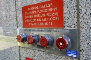
Much like the IBC, the International Fire Code (IFC) also has rules with regards to signage for new constructions and renovations. Fire Codes like Building Codes also vary by jurisdiction; however, what’s of utmost importance ultimately to firefighters on the scene is that when on location they know where they are, where they need to go, where hose connections are located, and the location of any and all access points. This means that throughout the building or rooms in a complex, key locations should be clearly marked and designated with proper signage.
When ensuring accessibility at your business, it’s important to stay on top of the latest requirements and guidelines or hire an expert who does this already. For us in the signage industry this is incredibly essential for us and our clients, so when we design ADA signs we have in-house experts who know what is allowed and what is required with regards to your signs. One element that’s especially important is the use of key symbols and icons on exterior and interior signage.
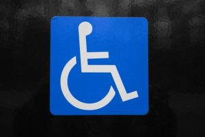
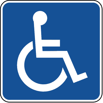
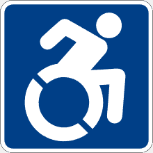
Accessibility symbols are in our everyday lives, and they’re more present in your life than you may even know. The most prevalent of these is the international symbol for accessibility. RIG Global, the organization that hosted the conference where the symbol was first designed, states that the “World Congress formally adopted the International Symbol of Access in 1969.”
In addition to the international symbol for accessibility, there are also other key symbols that highlight accessibility services or tools. Some of these are used on signs, print materials, and digital displays including phones, TVs, and other monitors.
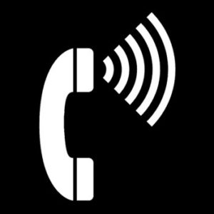
Telephone with Volume Control
This symbol represents access to telephones with enhanced sound and/or volume controls.
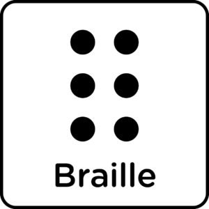
Braille Symbol
This symbol represents print material and signage that is written in Braille.
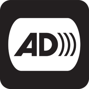
Audio Description Symbol
This symbol represents the availability of audio services for those with are blind or have low vision.
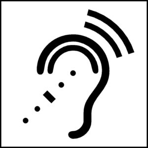
Assistive Listening Symbol
This symbol represents access to audio systems or tools for those with impaired hearing.
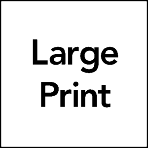
Large Print Symbol
This symbol represents the availability of print material or signage in large print font.
Sign Language Interpretation Symbol
This symbol represents the availability of sign language services or individuals to assist those with impaired hearing.
Information Symbol
This symbol represents the availability of information, services, tools, or print material to aid in accessibility.
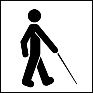
Visually Impaired Symbol
This symbol represents the availability of services or tools for those who are blind or otherwise have low vision.
This symbol represents access to a telecommunication device that helps deaf or hearing impaired individuals via a telephone system.
This symbol represents the availability of closed captioning services on a display or displays.
Though ADA guidelines are routinely reviewed, and sometimes modified and newly adapted at a national and international level, these symbols have stayed fairly consistent through the years. So a basic familiarity of these icons is a wonderful start to knowing a little bit more about the world of accessibility symbols.
———————————————–
We rely on our in-house team of ADA experts to help our clients with their ADA needs, and you can rely on us too. If you need ADA signage for your business, you can call us at Ortwein Sign 1-866-867-9208 or leave a message for us here: https://ortweinsign.com/contact-us/.
With the passage of the Americans with Disabilities Act in 1990, rules and regulations were implemented across the United States to help ensure accessibility for visitors and patrons of public buildings, gov’t buildings, and businesses. Over the past 30 years, the effort to increase and ensure access for all has only strengthened and with that so has litigation and compliance enforcement.
Though the DOJ is the chief authority enforcing and ensuring ADA compliance, states and local governments may, with approval from the DOJ, modify their regulations so long as the changes are certified by the DOJ. “Certification bridges the gap between the federal and state enforcement processes. The certification process neither delegates ADA enforcement authority to the states nor eliminates an individual’s right to seek relief through the federal courts. However, effective enforcement of a certified code can mitigate the need for federal enforcement by ensuring that new or altered buildings are accessible. This process gives building owners and design professionals some assurance in advance of construction that the ADA requirements will be satisfied. And, if a lawsuit is filed, compliance with a certified code may be offered as rebuttable evidence of compliance with the ADA.”
Modifications by state and local governments must meet or exceed ADA codes and regulations. In his Sign Expo 2021 session, “Accessibility & the ADA Crash Course”, Dave Miller, Managing Director of Nova Polymers, said that California is one such state that actually expanded their accessibility compliance rules. According to ADA.gov, “When these laws are inconsistent, the burden falls on building owners and design professionals to ensure compliance with both federal and state laws.”
Increased Litigation
Dave added in his presentation that as part of this increased emphasis on compliance 10 states have accessibility inspectors who, unlike general building inspectors, are solely focused on ADA compliance. Whether it’s due to the increased presence of inspectors in these 10 states, or the focus on accessibility nationally, the number of ADA Title III lawsuits has increased exponentially over the past 8 years, according to the data collected by Seyfarth Shaw LLP.
Though ultimately Seyfarth recorded a modest slowdown of ADA litigation in 2020, due to the pandemic, as they conclude “In January 2021, 1,108 cases were filed – the most ever in a single month. If the filings continue at their current rate, 2021 will be another record-breaking year for ADA Title III filings in federal court.”
Importance of Compliance
Dave emphasized in his presentation that the DOJ’s fees and enforcement should be seen as a hammer to incentivize compliance and not a money maker. Whether you see this act as a punitive measure, or an incentive, with the increased litigation year over year, on access in physical locations and digitally, business owners should do their best to ensure they are up to ADA standards.
Our Ortwein Sign team is versed in ADA guidelines at the state and national level, so that when we build your sign we can assure you that we have built it in compliance and installed your signage per ADA regulations.
As businesses open back up after the novel Coronavirus and more people venture back out into the community, there has never been more of a need for businesses to implement measures to keep employees and customers alike healthy and safe. To achieve this, businesses have turned to products including antimicrobial sneeze guards, screen protections, and other such protective devices.
As hot of a commodity as Lysol has been since March, another material kills bacteria, and it is called Antimicrobial Protection.
What is Antimicrobial?
When there is moisture present, the antimicrobial screen protector releases silver ions which bind to cellular enzymes to a microbe. Microbes have a negative surface charge, the silver ions with a positive charge are drawn towards them, disturbing the electrical balance which results in the bursting of cell walls, destroying the microbe.
In other words that most of us can understand, antimicrobial fights germs and destroys them!
As more companies implement “sneeze guards” also known as protective barriers, it is important to help customers and employees feel protected and welcome.
The VSI barriers are ideal for:
Hotels
Retail
Gas Stations
Grocery Stores
Nail Salons
Many Others Where Customers & Employees Interact
Antimicrobial screen protectors have been used in medical practices for years to shield workers from germs and viruses transmitted by infected customers. But these glass shields are now apart of the new normal. Whatever that new means for you and your business, screen barriers are seen as an essential way to ensure customers and employees feel safer.
Customized Branding
We can customize them for you with your branding. They are also created to have an architectural feel. This is done by custom designing them with printed logos and graphics as well as anodized aluminum attachments. These customized features give off a welcome look compared to the plain, wooden ones. They can also help keep a clean look and allow the business to print specific information on them.
Where can these be implemented in your business?
Commercial Monitors
Personal Devices
Touch Screen Surfaces
Dry Erase Boards
Why Can’t I just Lysol or Bleach Non-Microbial Surfaces?
Common cleaners can damage touch screen devices. Antimicrobial surfaces can actually lengthen the lifetime of products, especially touch screen devices used for your business. Therefore purchasing them is not simply a one-time cost but instead an investment in your business.
Benefits of purchasing Antimicrobial Protectors:
-Impact Resistance – will not shatter like other glass protectors
-Can be cleaned with bleach or non-bleach cleaners
-Custom-fit to your devices
-Extends the life of screens
-Lifetime Warranty
Call us today to discuss how we can help serve your business in maintaining a healthy atmosphere with custom antimicrobial protection!